Overview
The Jabar Design System (JDS) was created to establish a unified design and coding standard that simplifies collaboration between designers and developers in West Java. By providing standardized, reusable components and clear guidelines, JDS aims to accelerate digital product development, improve consistency, and enhance user experience.
Challenges
Inconsistent Products
Many digital products were outsourced to different vendors, each working without a shared guideline or standard, resulting in varying user interface (UI) designs.
Quality Issues
The absence of a design system often led to products that did not meet expected standards and hindered the user experience.
Maintenance Difficulties
Inconsistent design and coding approaches created challenges in maintaining and scaling digital products.
Time Inefficiency
Without reusable components, designers and developers often had to start from scratch, leading to longer development timelines.
Goals
The Jabar Design System was developed to address these challenges and achieve the following goals:
Improve Consistency: Establish a unified visual and functional language for digital products.
Enhance Efficiency: Provide reusable components to streamline the design and development process.
Increase Scalability: Enable easy duplication and scaling of digital products across multiple platforms.
Simplify Maintenance: Create standardized guidelines to make future maintenance and updates more manageable.
Deliver a User-Centric Experience: Prioritize accessibility, usability, and clarity to meet the diverse needs of West Java’s users.
Jabar Digital Service (JDS) followed a structured design process, guided by best practices and close collaboration with gov.uk. This began with research and analysis, including user interviews, usability testing, and stakeholder feedback to identify challenges. Benchmarking with gov.uk’s design system further shaped key principles focused on consistency, efficiency, and user-centric design.
Using these principles, JDS developed key elements such as design tokens, UI components, and a sandbox environment to test and prototype designs. Clear tone of voice guidelines were also defined to ensure professional, transparent, and approachable communication. The components and tokens were collaboratively built by designers and developers to enhance consistency, scalability, and technical feasibility.

A key bottleneck during the development process was the lack of clarity in designer-developer handoffs, which initially led to inconsistencies in how components were implemented. As the project progressed, this issue slowed down development and caused frequent revisions. To overcome this, the team enhanced the sandbox environment, adding detailed usage instructions, code snippets, and clearer handoff guidelines to streamline collaboration and ensure smoother integration.
The style guide consisted of:
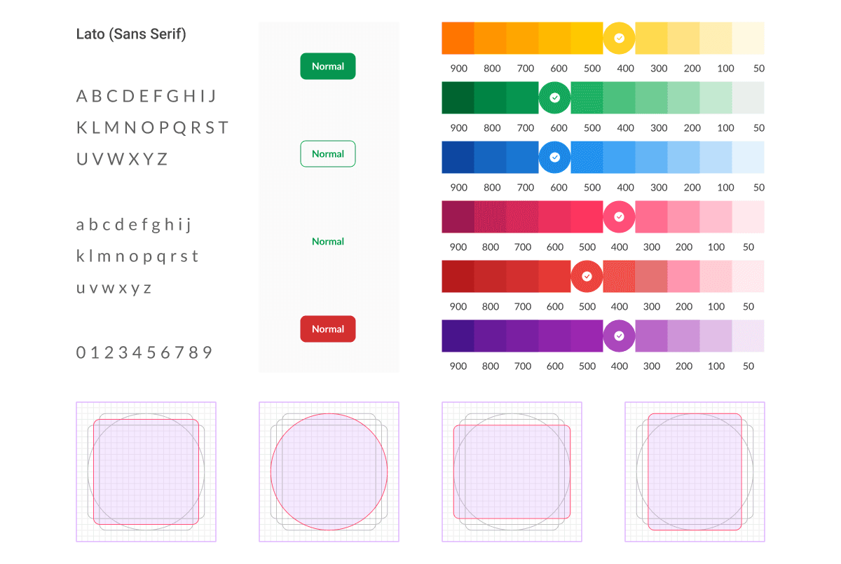
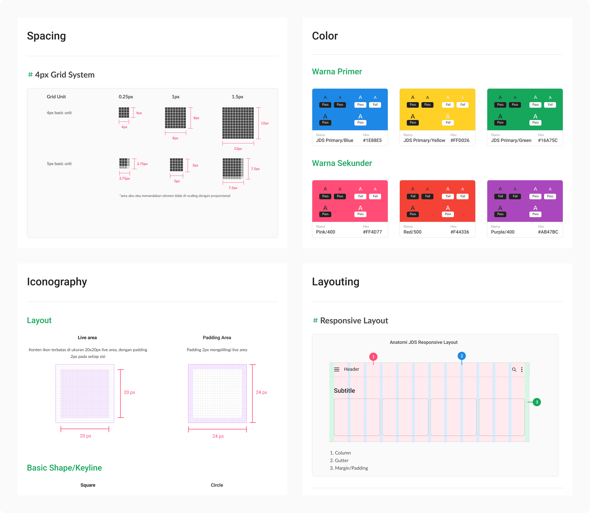
Design Tokens: Core visual properties like color palettes, typography, spacing, and elevation to maintain a cohesive look and feel across products.
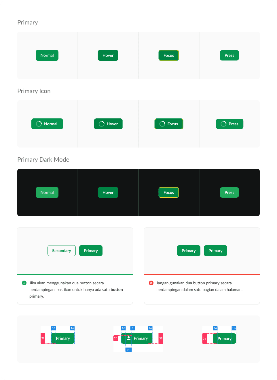
UI Components: Reusable interface elements such as buttons, headers, input fields, and cards to accelerate design and development.
Sandbox Environment: A space for testing, prototyping, and providing developer handoff, including detailed guidance on how to implement and use the components effectively.
Tone of Voice Guidelines: Communication principles that emphasize professionalism, transparency, and approachability to enhance user engagement and clarity.
The documentation provided comprehensive guidelines to ensure seamless adoption and implementation of the Jabar Design System. It included:
Getting Started Guide: Step-by-step instructions for designers and developers to begin using the design system.
Component Usage Documentation: Detailed explanations of each component, including visual examples, properties, and variations.
Design Token References: Documentation on color codes, typography scales, spacing values, and other core design tokens.
Developer Handoff Guide: Clear instructions for developers, with code snippets, sandbox usage guidance, and best practices for integrating components.
Tone of Voice and Writing Guidelines: Recommendations for maintaining consistent, professional, and user-friendly communication across digital products.

Result and Recognitions
Figma Community Usage: Since its release, the Jabar Design System has been accessed by over 5,300 users on Figma Community, expanding its reach and influence beyond West Java’s internal teams.
Positive Feedback and Adoption: The system has received positive feedback from designers and developers for its ease of use, clear documentation, and practical components.